Ovito is an egg-based fast food based in Brazil. From a simple idea, brand strategy, naming, brand identity, and all sorts of graphics – print and digital – were created for this eye-catching cool brand.
GDA 2019 Special
We were so proud of the outcome and success of this brand with the client that we decided – after being nominated – to apply to German Design Awards 2019. We were honored with a Special Mention in the branding category.
The Challenge
To create a brand strategy, name, and visual identity that would convey the spirit of the brand and help people feel relaxed and restore their energy during a busy day.
Kick Off
We started off creating a workshop to map all the aspects that we already knew: location of the store, target, menu, price range, etc. at this point we also discussed plans for the future, like expanding to the franchise). This immersion was vital to understanding key elements that would have to be taken into account.
Key Aspects
Main outcomes from the workshops:
Small store / Friendly / Smiley / A place for a pause, to grab a healthy and tasty snack and a coffee on a busy day / Fun and relaxing / Inclusive / All welcome
Naming
“Ovito” can be considered a nickname, meaning “tiny egg” in Portuguese. It’s admittedly friendly. This name was chosen after a creative process which also included validating if the name was available for official registration. We were really confident that the name contemplated the key aspects and – plus – was also a great name for a character.
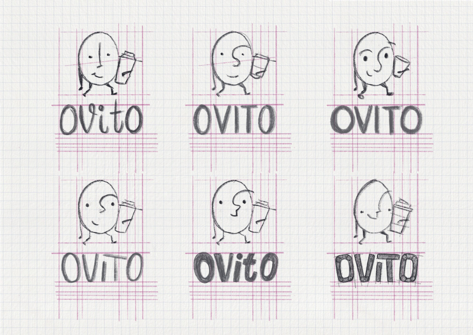
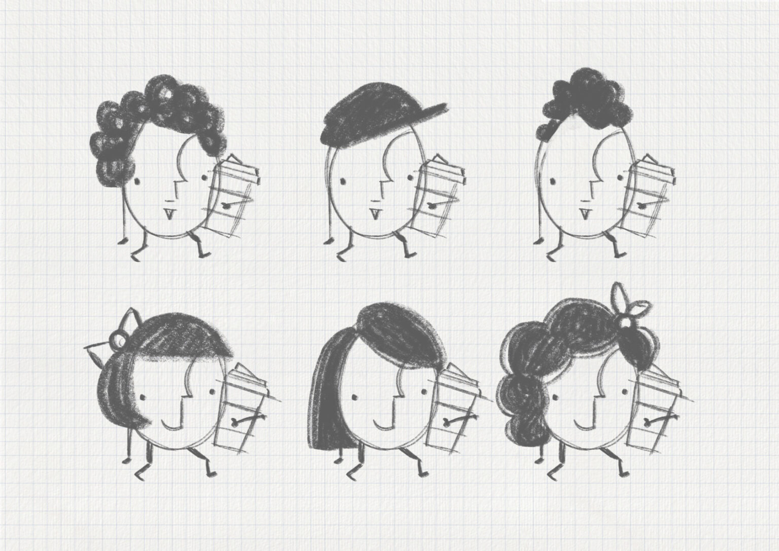
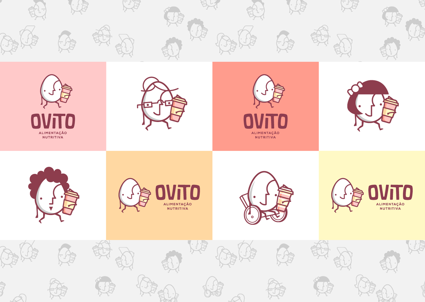
Sketches & Ideas
Inspired by the brand name, our starting point – after the mood board – was definitely exploring some options for a character in the format of an egg. For the logo, we also knew we were looking for something very straightforward, easy to recognize and read. This leads us to a sans serif, heavy font.
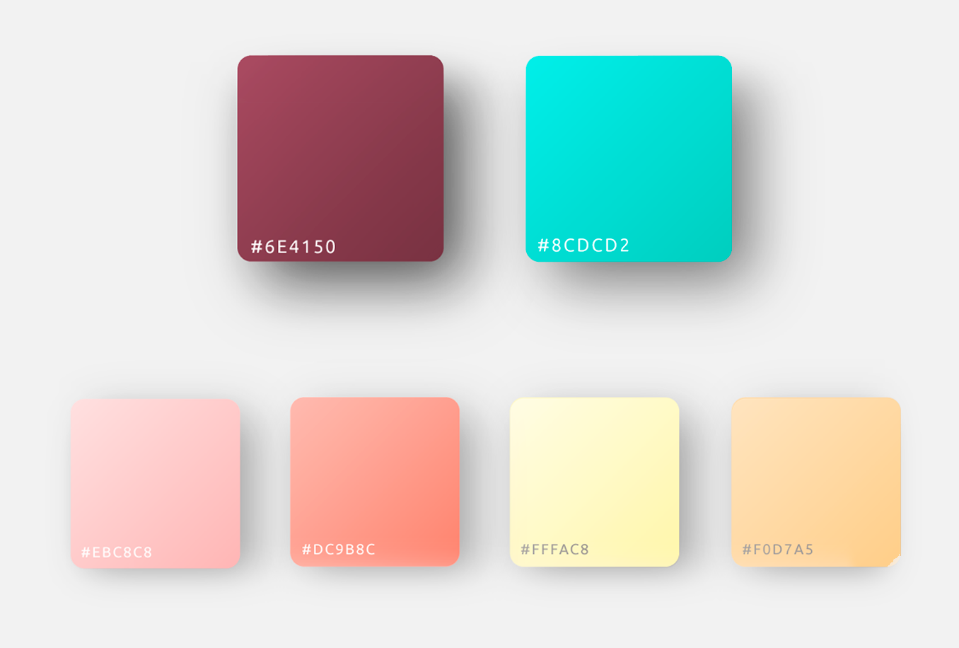
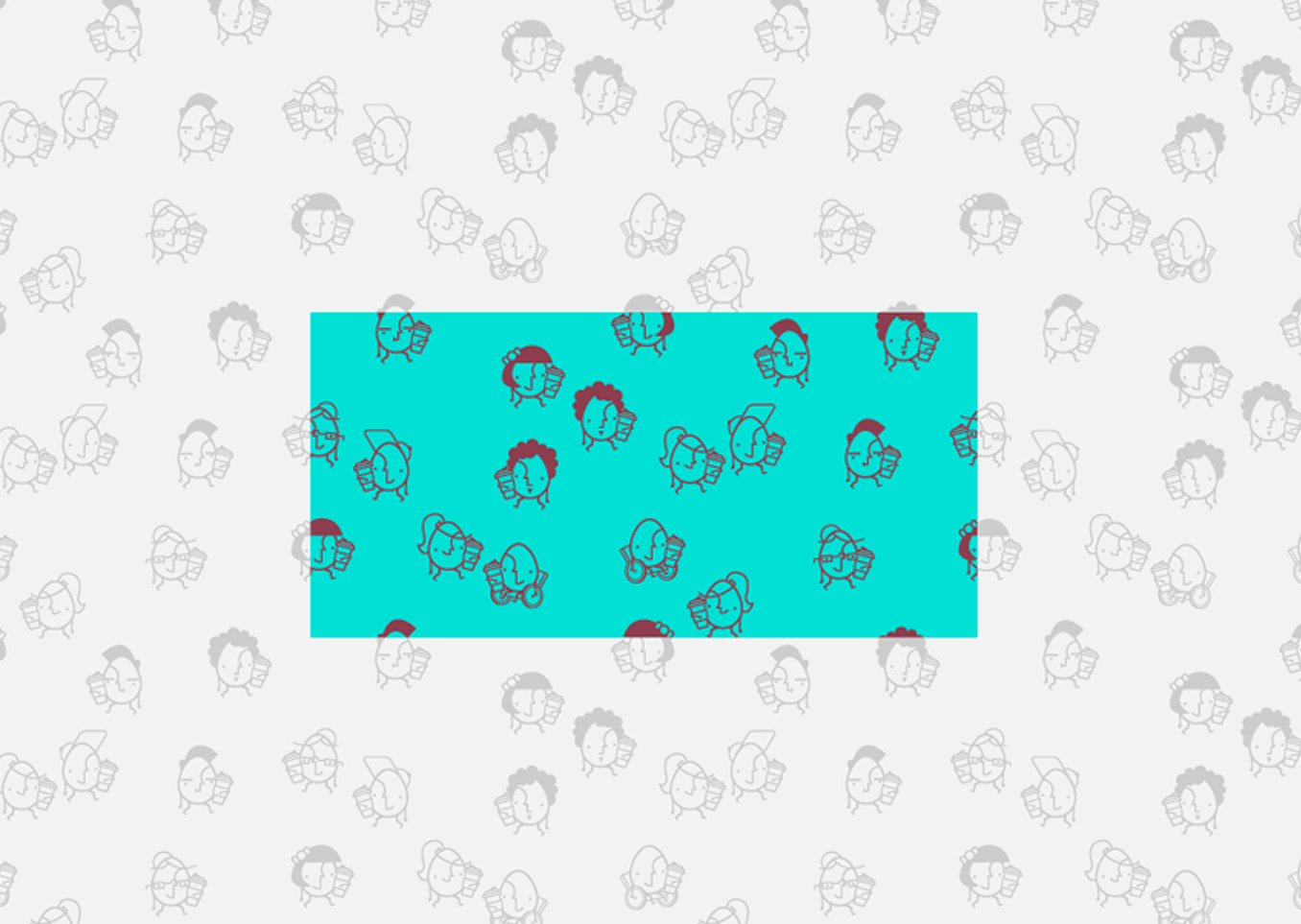
Colors & Elements
The colors played a big role in this project. We wanted something that would pop out, be fun but at the same time relaxing and pleasant. After testing several options, this palette was just perfect.
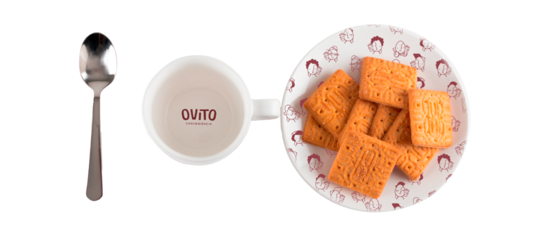
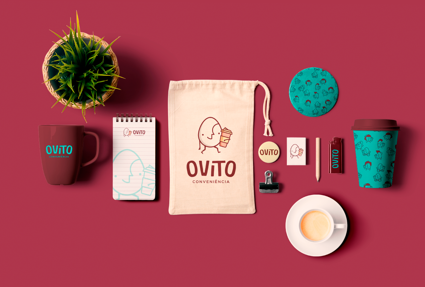
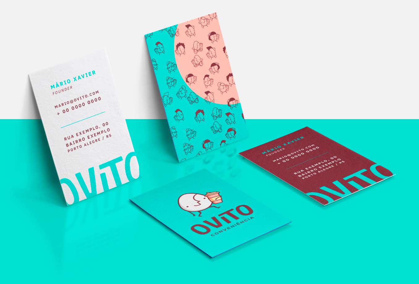
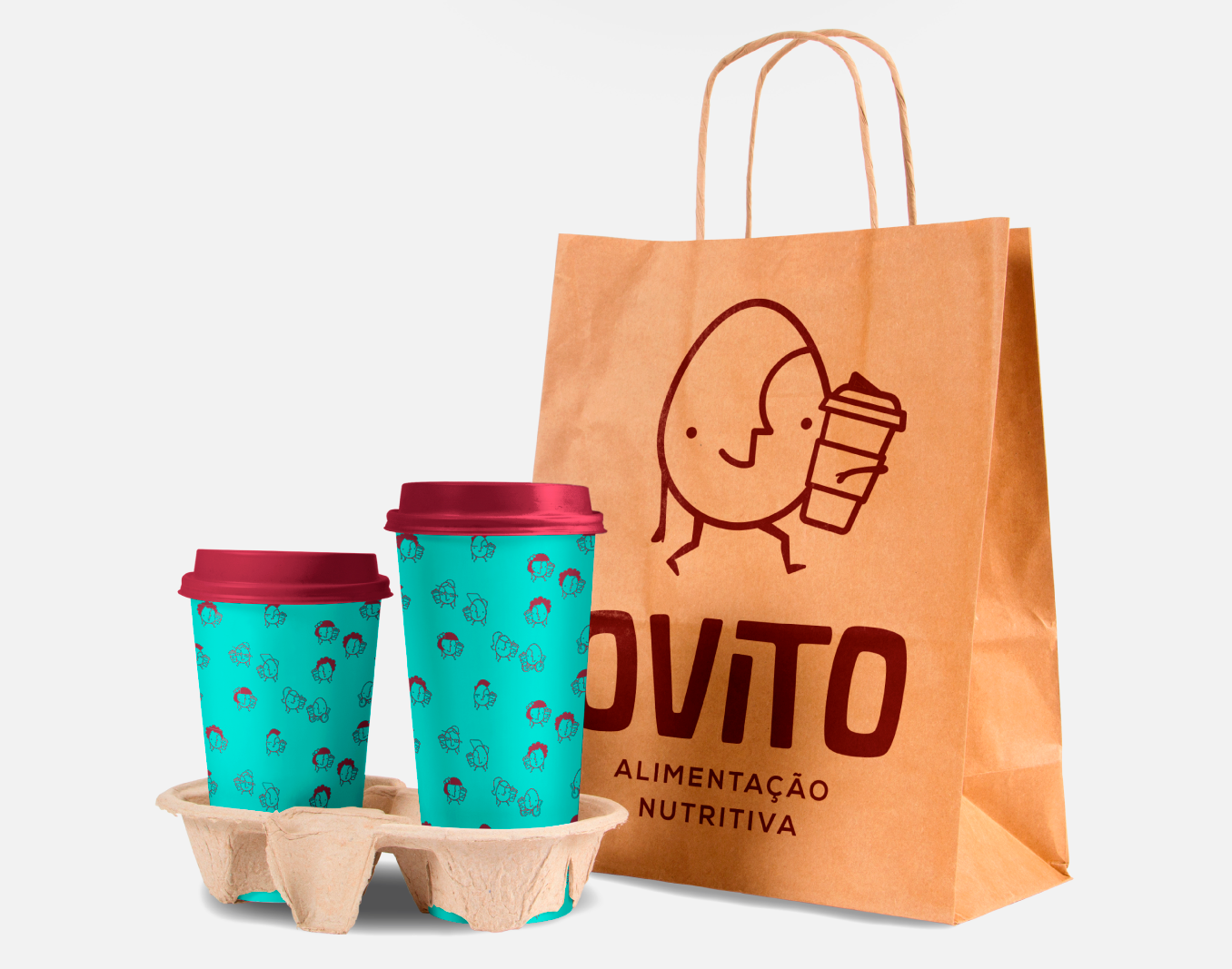
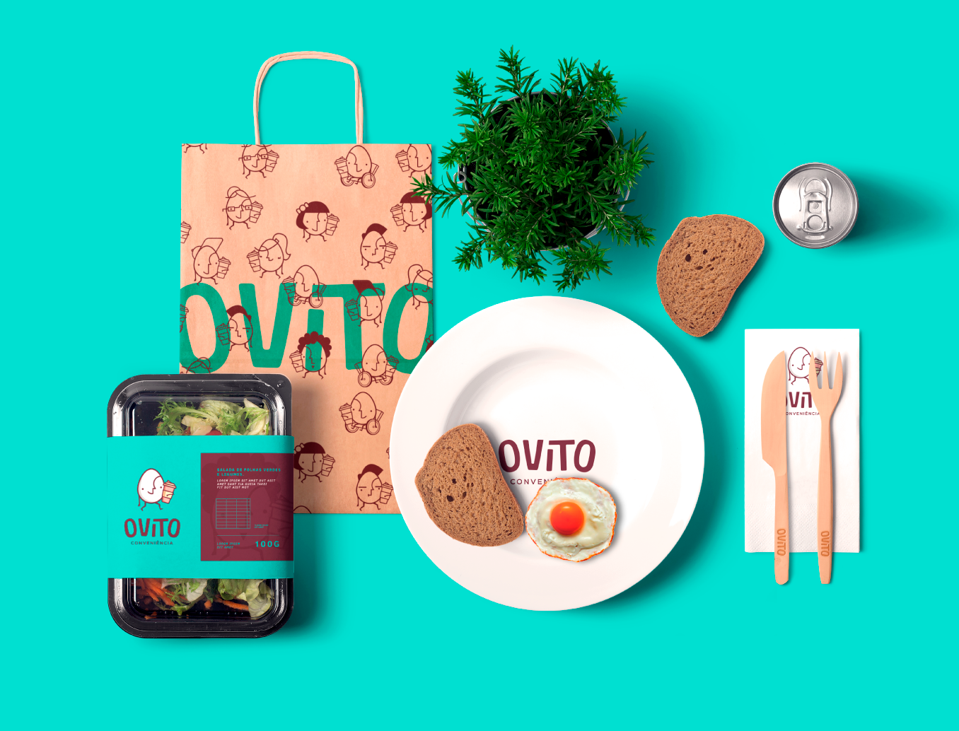
Mockups
Even before formal approval, we applied the brand in as many mockups as we could – this is extremely necessary to visualize if the brand works and is flexible for multiple uses.
Outcome
An eye-catching, friendly (and even cute!) brand that conquers the hearts of the consumers. As long as the restaurant was open, we received so much positive feedback from people of all ages – in fact, everyone felt welcome and inspired by this little guy! The KPIs indicated that the design efforts helped the brand to be recognizable and increased the percepction of value.
Credits & Mentions
Special thanks to my business partner at my studio Anatomia Design at the time – Ana Paula Sampaio; my intern at the time, Gabriel Fagundes and all Ovito team, particularly Mario Xavier, our stakeholder.