Berro is a motion design studio. Full of life, this young-soul company needed a brand new fresh look that would stand out and translate their bold personality.
GDA 2019 Awarded
We were so proud of the outcome and success of this brand with the client that we decided – after being nominated – to apply to German Design Awards 2019. We were honored with a Special Mention in the branding category.
The Challenge
How do you translate visually a company that is in constant movement, producing such distinct creative work?
To get the right answers, we needed to ask the right questions, and seeing the world trough their perspective.
The Kick-Off
A couple of workshops later, some key-drive elements were highlighted for the brand to be:
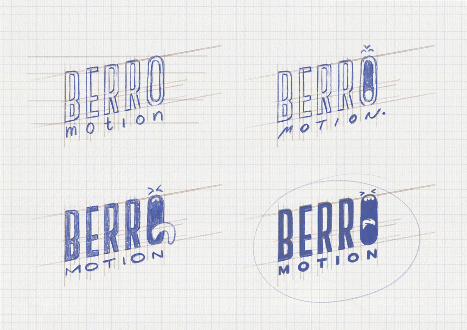
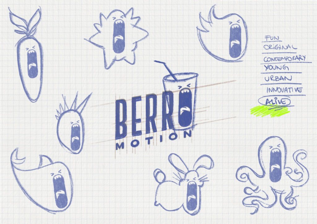
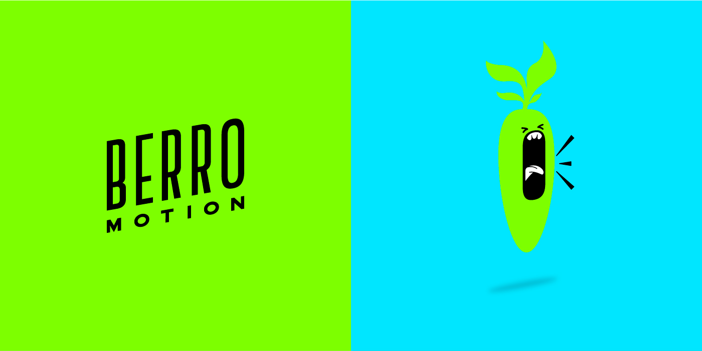
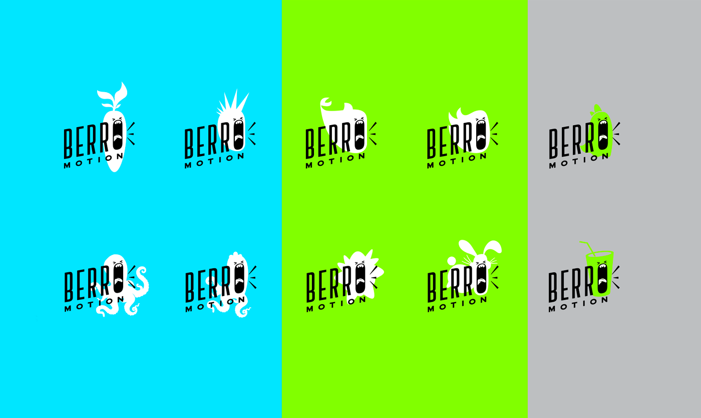
“Berro” means “shout” in Portuguese. This brand is spirited, and we were committed to deliver something unique, bold and unusual. The perception of “alive” and “bold” seemed to match just fine with some fun characters . And – why not – having lots of them, giving the brand something to play with and animate.
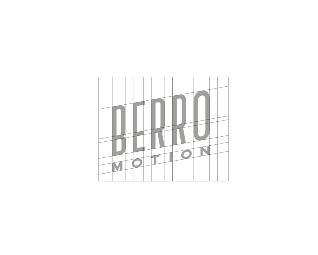
For the logo, an italic caps sans serif style matched just fine with our vision for an urban and straightforward brand.
Logo & Colors
For the logo, an italic caps sans serif style matched just fine with our vision for an urban and straightforward brand.
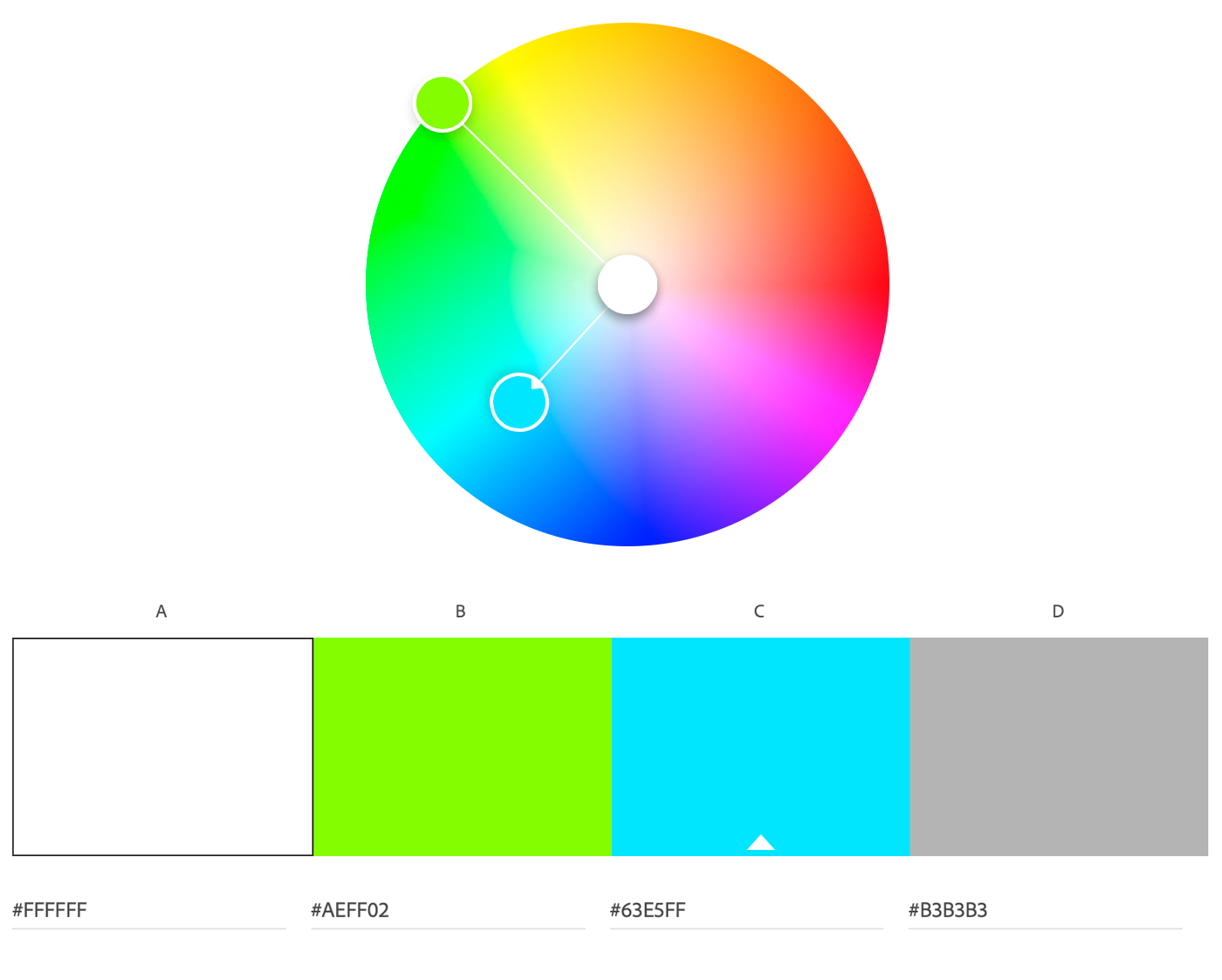
The main use for the brand would be mostly digital, so we knew we could explore vibrant RGB palettes. Colors should go nicely together, as well as with the white, black and grey basics. We decided to go with a saturated green and blue.
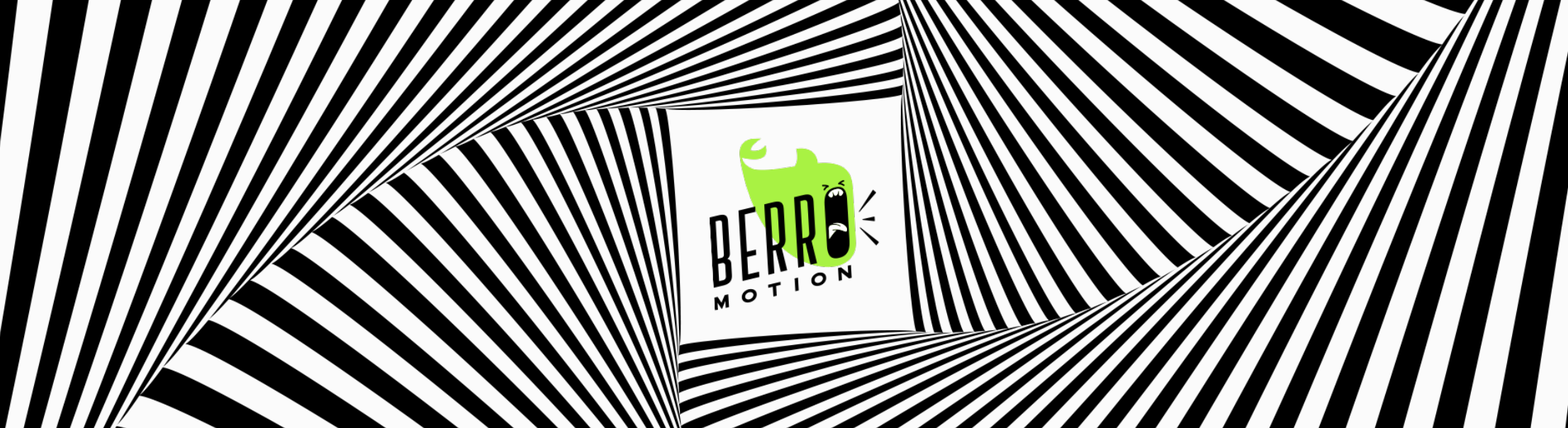
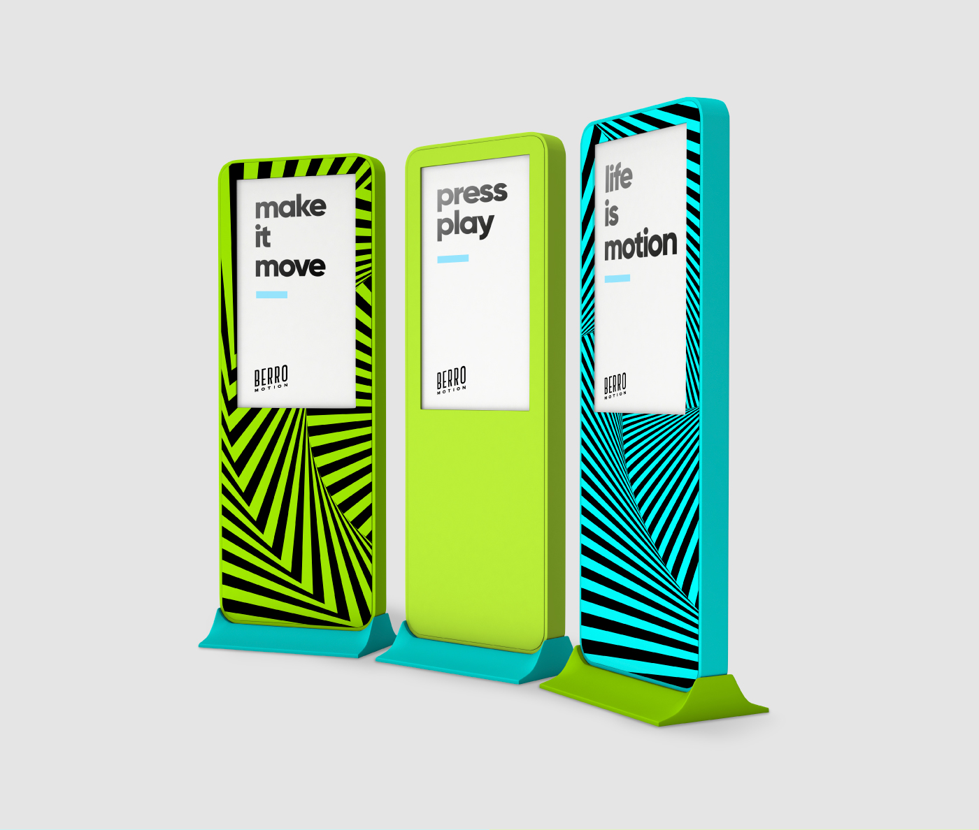
Optical Illusion:
a support system for the brand
Optical illusion styles were explored as a solution for ‘still’ visual options that would give a sense of movement, and the result was fantastic.
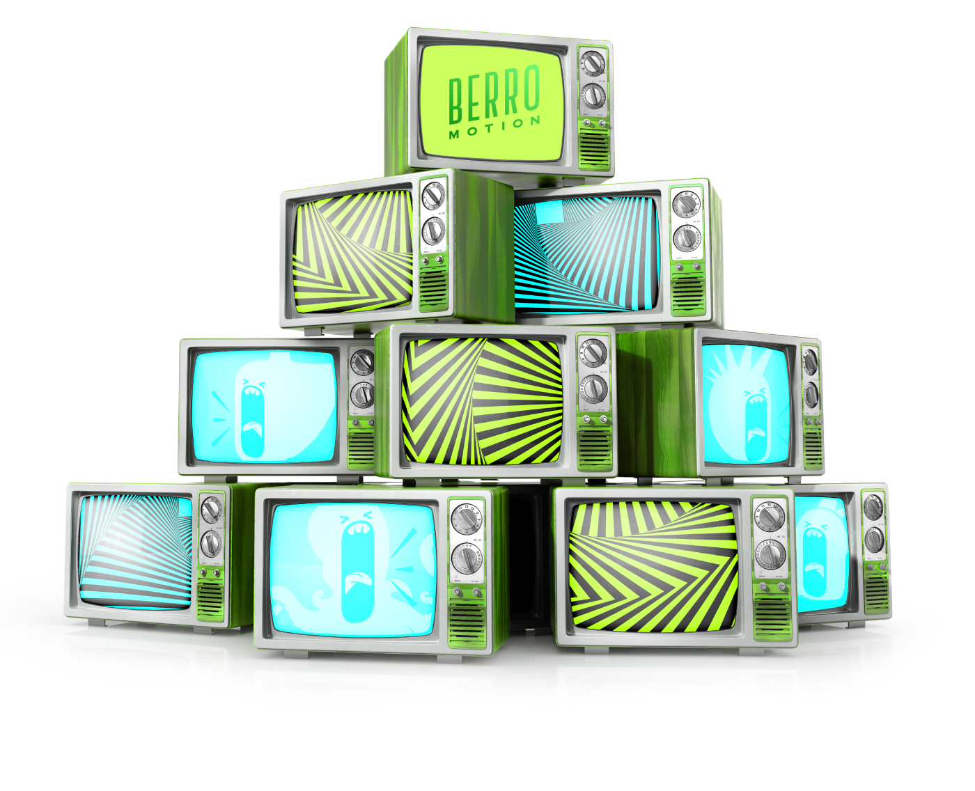
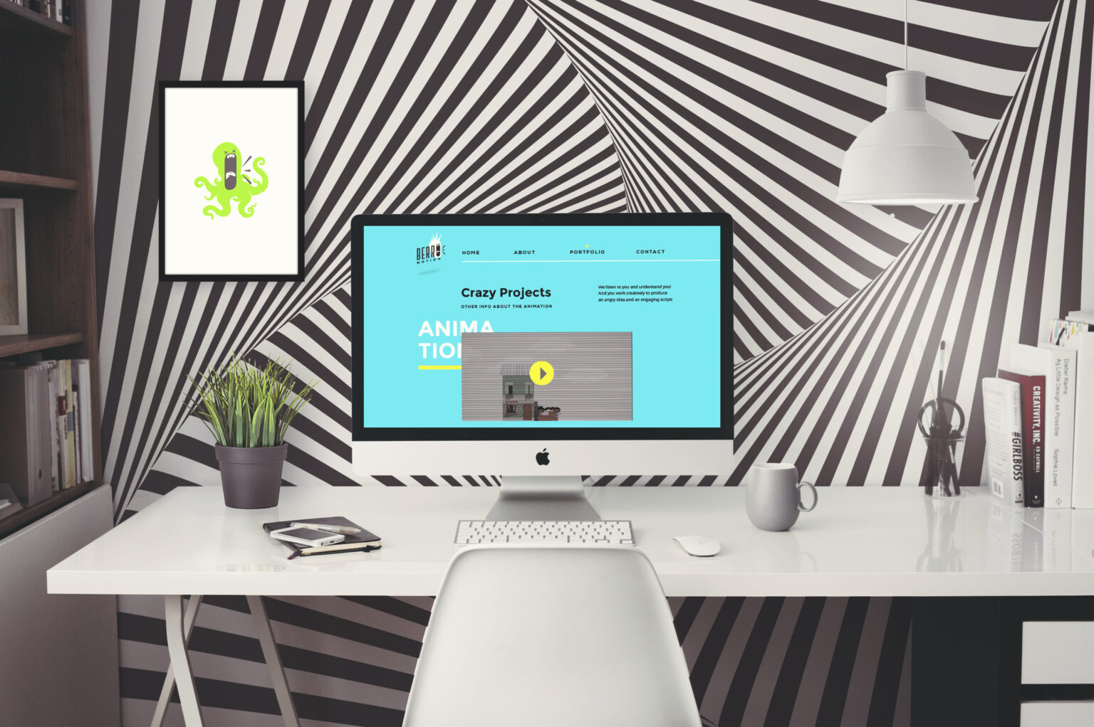
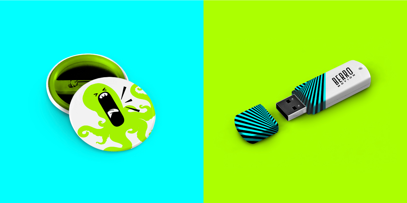
Mockups
No brand is ready to approve before going “live” applied to elements that are part of the brand’s ecosystem and style. I always like to go beyond stationary. Since this is an urban and video-making studio, made sense to apply this cool brand to skateboards and TV’s.
Videos & Filters
One thing that was amazing about this project is that the brand keeps being unfolded to this day. Berro’s team is extremely creative and often creates things like Instagram filters and institutional videos making the most of this brand.
I believe this is one of the best indicators that the brand was well thought out and designed – it follows, seamlessly, the company’s growth over the years.
A cohesive, consistent brand that is applicable and remarkable online and offline, raising value to the studio and allowing supporting the brand’s needs of communication.
The brand keeps unfolding this versatile, flexible and fun brand to Instagram filters, videos and many more.
Credits & Mentions
Special thanks to my business partner at my studio Anatomia Design at the time – Ana Paula Sampaio; my intern at the time, Gabriel Fagundes and all Berro Motion team, particularly Maria Celina Boa Nova and Bernardo Assis Brasil.